Let's Fly Together - Remastered

  • 12,283
    Posts
    12
    Years
    • Seen Oct 22, 2023
    Say hello again to...
    [a id]intro[/a id] A style released originally back in 2013, by yours truly.
    [a id]features[/a id] A little detail, please?

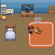
    Let's Fly Together is a dark theme. It features a beautiful artwork made by deviantART user Sa-Dui, which showcases the three legendary birds and a little Wurmple. The theme was made back in 2013, and this is our remastered edition, which is based off a design made by our lovely administrator Hiroshi Sotomura. With Get-Together coming up, now is the perfect time to re-introduce this forum style. So, let's jump to some pictures!
    [a id]screens[/a id] show us some screenshots

    The theme shows off a menu-bar that you might find in PC 1.5, and possibly even 2.0.


    New online list and statisics info style.


    Cleaner user control panel layout.


    anything else we should know?

    This had definitely taken some time and effort to get done, and I hope you all appreciate my work. If you guys wind up finding any bug, please respond here and say so; I'll get it fixed as soon as I possibly can. If you'd like to start using, simply click here.

    Enjoy, and thanks for taking your time to read this!
    BACK TO TOP

     
    Last edited:
    I don't like it, to be honest. =/
    It doesn't feel like the forum I've gotten used to.
    There are bigger fonts, there's no fixed-width, and all that.
    And it was supposed to be my favorite theme because it was a dark theme that suits my eyes...but ugh...

    But that's just me being picky...

    I'm gonna go back to The Y-Axis. =/
     
    Last edited:
    I don't really like it either, muchly prefer it's previous incarnation. Speaking of which, can we still use the original version?
     
    I think this style's blackish HUD doesn't suit the vibrant colours of the artwork at all. That being heard, I like to think that you guys are remastering styles (perhaps you guys can redo the ooooold ones) but this one is a bit too early. I do like the new sleek dropdown and things, though. Just maybe the colours give off a bad look?

    Or maybe I'm just used to the original thing too much...
     
    I like it in places, controls look a bit better. Though I don't think that bootstrap suits this style too well, a different framework might have worked more nicely. That and I would suggest avoiding massive fonts, try to keep a consistent level of sizes. So H1,H2,H3 and body text. At the moment it jumps across quite a number of font sizes (and some far too big such as for the who's online). That said, it does have a lot of potential all the same. It's getting towards being a lot cleaner. That and there are still a few bugs from the 1.5 Master Style itself such as the padding issue on empty notifications. I would also consider sizing down the social media icons too. Anyway nice work so far, but just a few things to tinker with to improve the style. Moving to another framework would be probably the most tedious though if you were to find a more accurate one for your style.

    [PokeCommunity.com] Let's Fly Together - Remastered
     
    Whoa~ Didn't see this coming. I actually like most of the changes that came with the upgrade, but the only nit-picky thing that I would like to point out is the increase in font size \: I wonder if that could be perhaps changed in the control panel...I shall continue my snooping around until I come up with a solid opinion regarding the theme.
     
    Considering that Let's Fly Together is my favorite style to use, I'm really happy to see a reskin of this in the works! That being said, I'm not exactly the biggest fan of the wideness of the pages. It ends up bloating up the text on the page which doesn't really appeal to me. If the pages could be the same dimensions as the old Let's Fly Together, that would be great!
     
    Looking great. The new fonts and wider posts look much more modern.

    The upscaling of nearly everything is a little new on my eyes, though.

    I'm not sure if it's just me, but the logo on the upper left looks a little offset. The paddings between top and bottom are a little unnatural.

    I guess I'm staying with DoC then. :x
     
    I like it in places, controls look a bit better. Though I don't think that bootstrap suits this style too well, a different framework might have worked more nicely. That and I would suggest avoiding massive fonts, try to keep a consistent level of sizes. So H1,H2,H3 and body text. At the moment it jumps across quite a number of font sizes (and some far too big such as for the who's online). That said, it does have a lot of potential all the same. It's getting towards being a lot cleaner. That and there are still a few bugs from the 1.5 Master Style itself such as the padding issue on empty notifications. I would also consider sizing down the social media icons too. Anyway nice work so far, but just a few things to tinker with to improve the style. Moving to another framework would be probably the most tedious though if you were to find a more accurate one for your style.

    For me, frameworks like this are easy to work with when I'm making things from scratch; PC's styles are based off vBulletin, since that's what it runs on, which makes it a little difficult. I'll look into it, though, and see what I could do. Yup, I've definitely noticed the padding problem, and am still trying to get it resolved. I would've applied custom styling to the text, but that can't be found in any template; I've looked everywhere. It's hidden inside some plugin, which I'm not able to edit, unfortunately. I could alternate its class and whatnot, but that would affect everything inside drop-down menus, and not just empty notifications. I'm still going to try and see if I could possibly find any work-around. Thanks for your advice, Gav!

    Considering that Let's Fly Together is my favorite style to use, I'm really happy to see a reskin of this in the works! That being said, I'm not exactly the biggest fan of the wideness of the pages. It ends up bloating up the text on the page which doesn't really appeal to me. If the pages could be the same dimensions as the old Let's Fly Together, that would be great!

    Sadly, I can't really do anything about that. This theme is supposed to be responsive, and change its layout every time you re-size your browser window or switch to some device with different screen size; if I make it fixed-width, it won't do that.

    It looks amazing, I like it, but you misspelled Wurmple in the begging xD
    I've been using Let's Fly Together since I joined PC :)
    Also in the bottom where it says "Style by Nymphadora" is that gonna change?

    Thank you! Oh, whoops, haven't that at all, haha. Sure thing; I'll update that pretty soon. Anyway, here are some changes, you guys:

    Updates

    • Statistic fonts have been turned smaller.
    • General font sizes are now more consistent.
    • Labels are no longer bold.
    • Couple of padding and margin issues are fixed.
    • Social media icons have been reduced in size.
    • Log-in box should now function better.
     
    For styling things you can't edit directly (since bootstrap is hosted elsewhere and you can't edit those files), you'll just need to find their ID's and Class names, then make a new ID or Class in your custom stylesheet and override the bootstrap code yourself using the !important rule. It's kind of a hack, but when working with CSS you can't edit it's the only way I can think of that works without being too messy.
     
    Do you think it'd be possible to make this new format on some of the others like Stunkfisk'd? I love the new format but i can't use it on my browntastic background ;~;
    My forums need to be derped.
     
    The only thing that's bugging me a little bit is the link that leads to the index page. I unintentionally clicked on it a couple of times.

    Eh? Does it do something in particular that I'm missing? o.o Similarly, I recently noticed that the navigational tabs at the top will enlarge to a giant black block. It could be my nit-pickiness coming out to play, so I apologize, but that's something I'd like to whine about ><
     
    For styling things you can't edit directly (since bootstrap is hosted elsewhere and you can't edit those files), you'll just need to find their ID's and Class names, then make a new ID or Class in your custom stylesheet and override the bootstrap code yourself using the !important rule. It's kind of a hack, but when working with CSS you can't edit it's the only way I can think of that works without being too messy.

    Jake's uploaded the bootstrap style-sheet to PC itself, I think, according to our headinclude template, so I could make a copy of it in a separate directory and edit things from there. Though, I'm still making changes using !important rule, but it might not exactly be such a good thing, so I'd probably have to change that when I can; since you're adding more codes in, it might wind up affecting your page-load speed. Soo, the more optimized your CSS are, the better, right? =)

    Eh? Does it do something in particular that I'm missing? o.o Similarly, I recently noticed that the navigational tabs at the top will enlarge to a giant black block. It could be my nit-pickiness coming out to play, so I apologize, but that's something I'd like to whine about ><

    I was editing navigation bar, and forgot to set it back to the way it was; sorry about that. It should be all fine now, hopefully. Let me know if you find anything else!
     
    Love the look and feel of this! Amazing work!
     
    I've been using Let's Fly Together ever since it was released. I really like the new touches to the remastered one. Kudos!
     
    Back
    Top