• Our software update is now concluded. You will need to reset your password to log in. In order to do this, you will have to click "Log in" in the top right corner and then "Forgot your password?".
  • Welcome to PokéCommunity! Register now and join one of the best fan communities on the 'net to talk Pokémon and more! We are not affiliated with The Pokémon Company or Nintendo.

What old generation looked the best to you?

41,350
Posts
17
Years
  • Each gen had its own unique style when it came to the pixels/sprites and 3D models! Most of the different generational games didn't look too similar to each other and most could be differentiated through various different ways. Which generation/games did you find to look the best? <3
     
    4,940
    Posts
    3
    Years
  • I think it's both RSE and DPPT. RSE are just iconic and they fit gameboy really well. DPPT, it's personal taste I guess. I might be just used to that graphics tho. I didn't like gen 5 style, indeed that's another reason why I went back to play gen 4 games. Matter of taste, I guess.
    RSE had a positive impact on me. I am a DS era child basically, so I played game-boy games later, but even in that case, I didn't feel that RSE style was an obstacle to me, it didn't feel old. On the contrary, I kinda loved it. And it added more value to my run on Emerald. That's not just about graphical style, but even about pokemon and music. After all they kinda all are under the "style" category, in some way.
     
    24
    Posts
    2
    Years
    • They/them
    • Seen Sep 9, 2022
    In terms of overworld design I found HGSS to be the most visually stunning, they were so bright! I never really liked the transition to 3D because things looked much more drab and generally washed-out - although USUM had a really nice UI on the bottom screen - and I feel like HGSS was the peak of this. I think Gen V's games had nice animated moving sprites, but I've always thought a more colourful and cartoonish aesthetic suits Pokemon more, and the Gen 2 remakes were the peak of this in my opinion.
     
    1,170
    Posts
    3
    Years
    • Seen yesterday
    Gen 4 has for me the best looking style among the sprite era, aesthetically it outclassed Gen 3 in every way.

    Gen 5 shot itself in the foot at times. Animated sprites came at the expense of uglier back sprites, and many of the Pokémon animations also looked weird, like some Pokémon were moving too much or moved in ways that didn't feel natural. Also not a fan of the bizarre 2.5D experiments they did in certain locations, so I think Gen 4's flatter and less pretentious graphics aged better.

    I also have a soft spot for Gen 2 graphics, think they have a charm and for some reason I actually like them more than Gen 3's.
     
    45,807
    Posts
    3
    Years
  • Gen 6 is it for me. I love replaying X/Y and ORAS.

    When they ditched sprites for 3D models I never looked back. The older sprites are overrated.
     
    23,331
    Posts
    11
    Years
    • She/Her, It/Its
    • Seen today
    That's a hard question for me to answer. From the really old generations gen 2 looks the best imo. Better than gen 1 and maybe even gen 3. I like that gen 4 has a lot of very dynamic poses especially when it comes to Pokemon sprites. I'm not too much of a fan of that generation but this is definitely an aspect of it that I do like. I also like gen 5's animations which might just be the best generation in terms of animation period, including all the 3D ones.

    In terms of the 3D games I like gen 6 and 7. But I think gen 7 edges out gen 6 just a little. Gen 8 isn't bad but having it on the switch definitely didn't help.
     
    207
    Posts
    4
    Years
  • HG/SS for me, Johto has some beutiful locations and the Gen 4 graphics made the HG/SS games look super good. I also enjoy Unova in B2/W2.
     
    17,133
    Posts
    12
    Years
    • she / they
    • Seen Jan 12, 2024
    I'm just totally bought into the pixel nostalgia of gen 1 and 2 lol
     
    41,350
    Posts
    17
    Years
  • HGSS were absolutely gorgeous. Especially those little landscapes of certain locations that really made me feel more immersed in the region - they were really detailed compared to other games I feel, and I loved the changes when you came at a different time of day. National Park had an especially lovely one (evening version below):

    images


    Gen 5 is probably my favorite though. Everything looked and felt so fluid. ❤️
     

    icycatelf

    Alex
    3,558
    Posts
    19
    Years
  • Maybe it's nostalgia talking, but I loves me some GSC aesthetics. Especially the overworld. HGSS has some of the nicest in-battle sprites though.
     
    5,285
    Posts
    14
    Years
    • Seen May 1, 2024
    Other than the ugly attempt at 3D on the lighthouse, I'm on the HGSS bandwagon here. Great to look at and everything seemed slightly less squared-off than Platinum (itself a step-up from DP, which seemed half-finished in some cases). I liked most of the sprites there the best too (in particular a combination of its sprite and overworld appearance made me finally realise Sandshrew was supposed to be cute. Those eyes!).

    My main problem with Gen V is where the 3D made it look like there was a tile but I couldn't stand / Surf there. Quite irritating. Nostalgia plays a part but I can really appreciate Gen III's aesthetic too (perhaps spoilt by starting out with Emerald, the best of the bunch).
     

    Palamon

    Silence is Purple
    8,158
    Posts
    15
    Years
  • Going to have to go with B/W because I liked how realistic the building felt in those games with the pixel art. But, I liked HG/SS, too in terms of overall pixel art.

    As for the others, D/P/PT looked fine, but they're not my favorite. R/S/E were alright looking, but still needed room for work.

    Not going to comment on the generations after because I don't feel like gens 6/7 are "old" yet.
     
    3,315
    Posts
    10
    Years
    • Seen Jan 1, 2023
    When it comes to Pokemon sprites I have a real soft spot for Yellow's and all of Gen2. Overall, I'm leaning towards Gen3 for best overworld, but I also have a ton of nostalgia here.
     
    5,285
    Posts
    14
    Years
    • Seen May 1, 2024
    Going to have to go with B/W because I liked how realistic the building felt in those games with the pixel art.

    Oh yeah, Gen V urban areas were actually really great. It's the routes where I was less of a fan, and the non-Chargestone caves (BW Victory Road was pretty col though).
     
    9,642
    Posts
    7
    Years
  • Gen 6. I can resoec that 3d won't be everybody's cup of tea, but the Pokemon models were quite beautiful in my eyes, looked solid from all angles and had lively battle animations, including the scenes for mega evolution. Every Pokemon also had a lot of expressivity and charm when you got up close and personal with them for interactions in Poke Amie. I spent a lot of time there, just petting my mons, feeding them, admiring their beauty.

    XY is a short game that doesn't frequently use cut scenes, but the ones they had did make use of the visuals in a way that got my attention like when the cover legendary appears it is breathtaking, you get the sense of the power and otherworldly qualitiy of that Pokemon as it breaks free, and think the story of AZ's floette was also told very sensitively, and think the delicate animation that looks like faded illustrations on pages from a book lost with time, is nice.

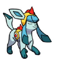
    Kalos Pokemon also mostly looked excellent in terms of design. There were some real beauties introduced in gen 6 like Xerneas and Auroras, Noivern, Talonflame, Pyroar, Vivillon, sleek Pokemon with attractive and alluring color schemes, graceful shapes that could really look majestic. It also created some cool-looking mega evolutions for existing Pokemon in both XY and Oras like for the Ralts line, the Kanto & Hoenn starters + the weather trio and more.

    The chibi 3d for trainers I find adorable, especially in XY because the camera doesn't look quite as far back as it does in Oras, and I think that makes everyone look more approachable and lively, and you can customize your trainer in XY. Both Oras and XY are pretty games though, and I think they make perfect foils for eachother with a contrast like night and day. Oras is good at recreating in detail the natural beauty and charm of Hoenn's idyllic landscapes, whereas Kalos is this almost surreal place, full of opulent, glittering cityscapes. Personally I got to hand it to Kalos for it's more risk-tasking designs, clearly they had a lot of fun with it's architecture like Parfum Palace, and the huge sundial in Anistar City, all of Lumiose City, imaginative gyms like the dollhouse one for the fairy Pokemon, and the gym that seems to be floating in space with the psychic pokemon.
     

    Adam Levine

    [color=#ffffff][font="Century Gothic"]I have tried
    5,200
    Posts
    12
    Years
  • Generation V is an obvious winner for me, but I won't get into why, because I'm sure everyone knows why.
    So I'll instead talk about Generation III, whose aesthetic is a runner-up in my eyes. I'm not sure why, but I just love the artstyle, especially on the Pokémon sprites. I'll just post a few sprites to show you what I mean: the left one is from Generation III; the right from Generation IV.
    Spr_3e_024.png
    Spr_4d_024.png

    I'm not sure what it is, but the sprite on the left just looks more appealing to me. Sure, the right sprite is obviously more polished because it's not as limited in terms of color or size as the left sprite, but I don't know. I just like the style of the left sprite, particularly the shading. Here's a more drastic example:
    Spr_3e_024.png
    Spr_4d_435.png

    Arbok and Skuntank have somewhat similar colors, but Skuntank's sprite definitely has less shading than Arbok's. I lowkey wish they kept the Generation III shading style in Generation IV (which they did during development, as seen below, but changed later on).
    Ed4rn6pXsAEO_9M.png
    Spr_b_4d_461_m.png
    Spr_4d_446.png

    You can see that Weavile's and Munchlax's beta sprites have more shades (or at least, their shades are much more visible) on them than their final sprites. I can see why people would prefer the simpler sprites with more refined colors and less rendering detail, but the GBA games' artstyle is just eye candy to me.
     

    pkmin3033

    Guest
    0
    Posts
    It's always going to be Gen IV for me. I think that Pokemon was at its peak during this gen, and the visuals are a huge part of that: DPPt were a huge step up from RSE, and Platinum in particular really stood out; I loved the Distortion World. Gen V was aesthetically gritty and bland and, whilst that was thematically appropriate for the region, I missed the brighter colours present in Gen IV. HGSS just popped right out of the screen and for its time it was incredible, and they've aged very well even now. There's just something delightfully timeless about pixel art that isn't present in 3D models; they capture the personality of the Pokemon so much better even with static poses. Having a Pokemon stuck in a single, expressive pose is better than having it shuffle/hover/bob/whatever lifelessly in one place, even if said model offers greater detail...lest we forget the AWFUL models for Xatu and Swellow, to name but two.

    But I will give props to Alola for capturing that tropical spirit, both in its UI and in the general improvement in the visuals of the locale. Alola I could have enjoyed a lot more than I did under different circumstances I think, in a lot of ways it felt like what I imagine HGSS might have if they were rendered in 3D.
     

    ShadowLugia111

    Birb Obsessed
    54
    Posts
    11
    Years
  • I love Gen 4 sprites to death. Gen 4 was my childhood, man. ~v~

    I remember being super hyped for Gen 5 getting animated sprites in 4th grade, but looking back at them now, I notice their messiness.
     
    Back
    Top