• Our software update is now concluded. You will need to reset your password to log in. In order to do this, you will have to click "Log in" in the top right corner and then "Forgot your password?".
  • Welcome to PokéCommunity! Register now and join one of the best fan communities on the 'net to talk Pokémon and more! We are not affiliated with The Pokémon Company or Nintendo.

5th Gen Logos A No-Go?

Do you like the English logos of Pokemon Black/White Versions?


  • Total voters
    92
Status
Not open for further replies.

fenyx4

HOENN CONFIRMED!
  • 1,761
    Posts
    15
    Years
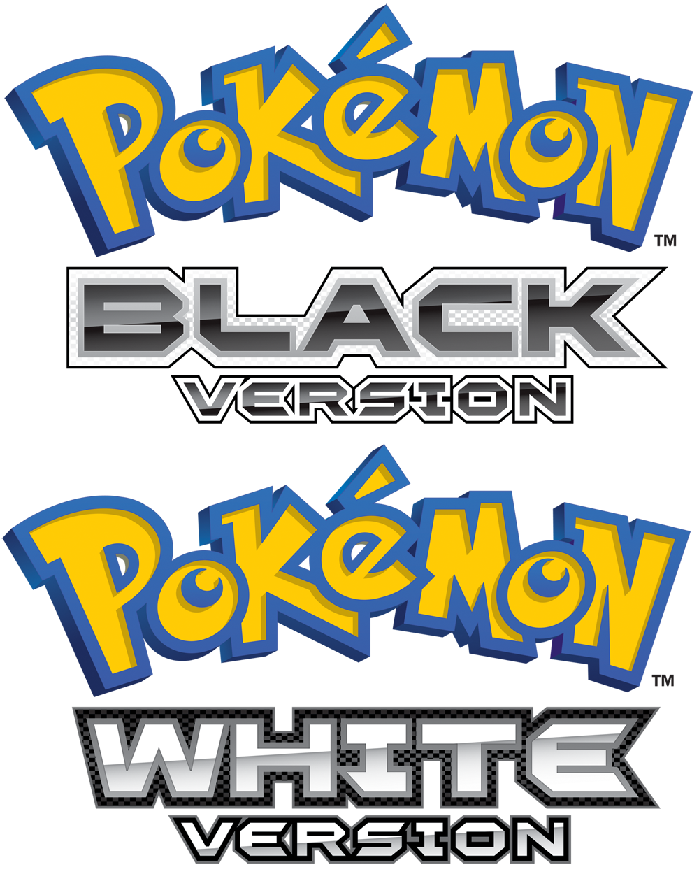
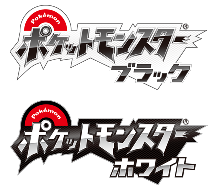
    I browsed for a thread referencing them, but I haven't seen any discussion of them. Anyway, the English logos for Pokemon Black and White Versions have been unveiled! I first saw them on www.pokemon.com in the flash animation of the the reveal of the English names of the Isshu Unova starter Pokemon. For comparison...

    Japanese BW logos:
    Logos A No-Go?


    English BW Logos:

    Logos A No-Go?


    So, your opinions? I like the alternating black-and-white coloration that was preserved from the Japanese logos, but I partially dislike the font. "Black" looks like it was written very well in an awesome way, but it looks like the White Version logo got harshly kicked in the side, with the "E" of white desperately trying to copy the "K" of black in a very odd manner. :cer_no:

    In both logos, the font looks terrible when used to write out the word Version. Some of the letters just look...janky. I would've preferred the bubbly logo introduced with RSE and maintained in DPPt, or the awesome Bank Gothic font used with HGSS (which, despite its overuse, ups the coolness of anything by 100%).

    So, do you like the English BW logos? Discuss! :)
     
    Last edited:
  • 546
    Posts
    13
    Years
    Hm, I thought I was the only one who cared... x3
    In my opinion, these logos are TERRIBLE compared to the Japanese ones. The hideous yellow and blue colors of the 'Pokemon' in the logo stands out too much, and the way they have 'Black' and 'White' looks kinda... robotic. Y'know what I mean? =/
     

    Ho-Oh

    used Sacred Fire!
  • 35,992
    Posts
    18
    Years
    • Seen Jul 1, 2023
    ...

    I never saw these. ;;
    Oh God, they look terrible, seriously.

    The black that's meant to be in the two logos surrounding or inside of "black" and "white", looks... terrible. D; I would've liked it if they kept the Japanese logos and just put English text on them >____>; The font looks bad too, but meh.
     

    King Gumball

    Haven't been here for ages...
  • 2,179
    Posts
    13
    Years
    I actually disagree. I like them better than the Japanese ones. I thought the Japanese ones were a little shabby, or messy and unnecessarily large. Whereas the English ones are nice and 'modern day' and very neat and well placed. Though I do think the colouring could have been a little better.
     

    femtrooper

    Starfleet Commander
  • 272
    Posts
    13
    Years
    Honestly, they look like crap compared to the Japanese logos. Oh well, the Japanese stuff is always more epic.
     

    El Diabeetus

    Amateur Voice Actor / ROM Editor ('Hacker')
  • 1,064
    Posts
    17
    Years
    • Age 30
    • Seen Jun 10, 2020
    I kinda wish they'd adapt the logo more. Keep the same logo in English just, jazz it up a bit. The Black and White version logos themselves look nice, but the same generic Yellow/Blue coloring could be done away with. I don't like to point my signature. But, something like that. Where the Pokémon logo itself has some slight alterations and keep the same Black/White font that's on the current logos.
     

    TJgamer

    A Pokémon Poet
  • 1,093
    Posts
    14
    Years
    • Seen Oct 13, 2021
    I think they're perfectly good.
    Who wouldn't like them?
     
    Last edited by a moderator:

    AshPikastar

    It's Question Time!
  • 1,746
    Posts
    13
    Years
    I like how the Japanese version has the Pokeball in the logo while the English just kept the original Pokemon logo name and just added "Black" or "White" underneath. It just seems like the Japanese design has a better design then the English. The English made it look a bit boring.
     

    King Gumball

    Haven't been here for ages...
  • 2,179
    Posts
    13
    Years
    Black and White are too boring colours, so that could be a factor as to why they designed the logos how they did. The Japanese designs dont really suit the names IMO.
     

    Enigma

    [i][font=Noto Serif][color=#e2ad53]The [color=#d94
  • 1,221
    Posts
    16
    Years
    They look really bad. The yellow and blue Pokemon logo with the 'Black Version' and 'White Version' text together look terrible. The font isn't that great either, but could have been excusable if the colors would have blended together better.
    Somehow, I was expecting this. However, it's not the logo that matters to me, it's the game itself. :3
     
  • 2,334
    Posts
    16
    Years
    • Age 33
    • Seen Aug 21, 2021
    No I don't like them, it seems like the japanese always get nice classy logos and we get the bog standard yellow one that's been around forever. :/

    It also seems lazy, like they didn't bother and just slapped on the old reliable...
     

    TJgamer

    A Pokémon Poet
  • 1,093
    Posts
    14
    Years
    • Seen Oct 13, 2021
    No I don't like them, it seems like the japanese always get nice classy logos and we get the bog standard yellow one that's been around forever. :/

    It also seems lazy, like they didn't bother and just slapped on the old reliable...

    I will admit it is a bit lazy. Mostly for the original blue and yellow style.
    It's still acceptable in my opinion.
     

    Azumi

    ★七色に光る女★
  • 1,631
    Posts
    16
    Years
    The only big problem I really have for the logo is
    Logos A No-Go?

    this thing.

    Just... why? The localization team could've really put much more effort on making this match the spiffy words below! It's not hard at all!
     

    Aquacorde

    ⟡ dig down, dig down ⟡
  • 12,527
    Posts
    19
    Years
    I just... do not like. It could've been so much cooler & more stylish. The "Version" part is unnecessary and the giant yellow&blue "Pokemon" just puts me off. It does not flow. :/
     
  • 2,982
    Posts
    15
    Years
    It's true. The original Pokémon logo doesn't really fit in with the style of the version name and logo. I might as well change the whole thing completely rather than keeping that logo.
     

    Mew~

    THE HOST IS BROKEN
  • 4,163
    Posts
    15
    Years
    • Seen Apr 13, 2016
    Honestly, most of you people just dislike things for the sake of it...

    I quite like the logo's at least they arn't the same as all the other games with the boring font (Although HG/SS had different logo's too) I like the pattern highlights around the words too. Very simple but effecting ={P
     
    Status
    Not open for further replies.
    Back
    Top