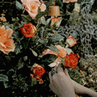
Everyone knows that nintendo has gotten super lazy and uncreative in their later years of pokemon. We can all admit that when comparing Gen I Pokémon to Gen VI, Gamefreak put in a lot more thought back then. So what do you guys think some of the most un-creative Pokémon designs Gamefreak has made are? Here are two that I think are terrible:
Garbodor: Who would make a Pokémon that is just, well, garbage... Literally, garabe. A living pile of trash? Just.. no.
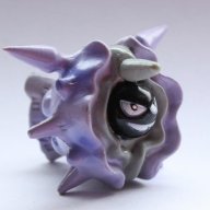
Klefki: Creator 1: Ok, what Pokémon are we going to make next...
Creator 2: *Looks at car keys* "I've got it. Car keys!"
Creator 1: :') Its.. Genious.
Really.
Garbodor: Who would make a Pokémon that is just, well, garbage... Literally, garabe. A living pile of trash? Just.. no.
Klefki: Creator 1: Ok, what Pokémon are we going to make next...
Creator 2: *Looks at car keys* "I've got it. Car keys!"
Creator 1: :') Its.. Genious.
Really.


![[PokeCommunity.com] Most Uncreative Pokémon Designs?](https://www.smogon.com/dex/media/sprites/rb/rhydon.png "[PokeCommunity.com] Most Uncreative Pokémon Designs?")
![[PokeCommunity.com] Most Uncreative Pokémon Designs?](https://www.smogon.com/dex/media/sprites/rb/nidoking.png "[PokeCommunity.com] Most Uncreative Pokémon Designs?")
![[PokeCommunity.com] Most Uncreative Pokémon Designs?](https://www.smogon.com/dex/media/sprites/rb/nidoqueen.png "[PokeCommunity.com] Most Uncreative Pokémon Designs?")
![[PokeCommunity.com] Most Uncreative Pokémon Designs?](https://www.smogon.com/dex/media/sprites/rb/kangaskhan.png "[PokeCommunity.com] Most Uncreative Pokémon Designs?")
![[PokeCommunity.com] Most Uncreative Pokémon Designs?](https://www.smogon.com/dex/media/sprites/c/feraligatr.gif "[PokeCommunity.com] Most Uncreative Pokémon Designs?")
![[PokeCommunity.com] Most Uncreative Pokémon Designs?](https://www.smogon.com/dex/media/sprites/c/tyranitar.gif "[PokeCommunity.com] Most Uncreative Pokémon Designs?")
![[PokeCommunity.com] Most Uncreative Pokémon Designs?](https://www.smogon.com/dex/media/sprites/rs/aggron.png "[PokeCommunity.com] Most Uncreative Pokémon Designs?")