• Our software update is now concluded. You will need to reset your password to log in. In order to do this, you will have to click "Log in" in the top right corner and then "Forgot your password?".
  • Welcome to PokéCommunity! Register now and join one of the best fan communities on the 'net to talk Pokémon and more! We are not affiliated with The Pokémon Company or Nintendo.

Icontest #1 - Pokemon [Results out + Selection of next topic]

Whose icon appeals to you the most?


  • Total voters
    29
  • Poll closed .
Status
Not open for further replies.

derozio

[b][color=red][font=helvetica][i]door-kun best boi
5,521
Posts
14
Years
{Icontest - Pokémon}

D
eadline - May 31st, 2013

Rules

  • Please make sure that you, as participant, vote before 31st. It is optional for non-participants but it isn't so for you. It's mandatory that you vote or you'll be disqualified.
  • Although it's okay if you just vote and go along, it is expected of you that you make a small post underlining why you voted for the icon that you did. No need to write huge paragraphs; a single line would honestly suffice if you don't want to write much!
  • Do not vote for yourself.
Entries -

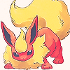
TwilightBlade
flareonicontest.png

Stock used: link

EternallyAnna
icontest001_zps3812545d.png

Stock 1 & Stock 2.


Wolflare
55ZIOam.png

Stock Used

NecrumWarrior
picture.php

Stock 1
Stock 2
Stock 3

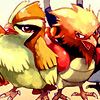
Alexial357
pidgey_spearow_icon_03_zps2c7877f3.jpg

Stock

fortworth96
307vpco.jpg

Stock 1
Stock 2
Stock 3

Twilight Sky

C1WmcRn.png

Stock

GolurkIsDaBomb
tpfNeoW.png

Stock

jellicentfan1

q6rXwgo.jpg

Stock

Reb0rn
Pokeicon_zps54340d45.png

Stock

Sunfished
Stunfisk_zps0d8db6b3.png

Stock

Aerilyn

aY5kHsx.png

Stock

LilJz1234

WindowsPhotoGalleryWallpaper20110504075339_zpscf6280b8.jpg

Stock

Snor(es)lax

1hTf8lg.png

Stock

Tackle
chespin_icon_by_tacklegeorge-d64z56p.png

Stock

Snowdrop

tumblr_mmpikisjfT1refwjmo1_100.png

Stock: http://archives.bulbagarden.net/medi...176Togetic.png

Miss Doronjo

IconContest100_zpsdf6b5523.png

Stock used: click!

Toshiro.
a0c3g0.png

Stock can be found here.

Avishka

WtWjD2g.jpg

Stock

Fire flyy

2VIEG.png

Stock
I could've made this a little more organized but I'm not on my PC. So yeah, sorry for the messed up layout of the thread. :( Anyway, let the voting commence!
 
Last edited:

Sirfetch’d

Guest
0
Posts
Congrats to all of the contestants, as all of the icons really turned out well. This was my first time making an icon and it was really fun. I look forward to participating in the other icontest as well! I will update my post later with the one I voted for, as I have not decided still because it is so hard to choose.

I decided to cast my vote for Golurk's because I just love the way that the colors are used on the Kecleon and the pose is just right. It really has that icon feel to it. I also feel that it is a bit more unique than the others and that is what won me over. It was a hard decision as I had narrowed it down to Wolf's, Alexial's, Derk's, Fire Flyy's, and Tom's and ultimately decided to vote for Tom's icon. All entries were great though!
 
Last edited:

moments.

quixotic
3,407
Posts
15
Years
Voted for Aerilyn, loved the cleanness of the icon and the contrast between empty space and bright colours. Twilight Sky was a very close second, and while I adore the style of colouring used, I felt Aerilyn's just felt nicer as an icon.

Great entries from everyone!
 

Aquacorde

⟡ dig down, dig down ⟡
12,503
Posts
19
Years
I love Wolflare's. The lighting/contrast and positioning make the icon dramatic and create a feel of latent power and a precursor to movement.

basically what i'm saying is that it's cool
 
17,133
Posts
12
Years
  • Age 33
  • she / they
  • Seen Jan 12, 2024
Gunna cast my vote for Toshiro! It's so cute! :3 not an expert critique, I know

I wish you could all be winners ;; Really quality work from everyone!
 

TwilightBlade

All dreams are but another reality.
7,243
Posts
16
Years
Snowdrop gets my vote. I'm impressed with how she made a beautiful icon using official art. I adore the lovely pinks and blues in her piece. The rainbow light makes the icon pop, too. Honorable mention goes to Fire Flyy for using a very cool color scheme.

All really wonderful entries! Best of luck, folks. go make a gallery!
 

Sunfished

(╯°□°)╯︵ ┻━┻
429
Posts
12
Years
  • Age 28
  • Seen yesterday
Golurk's won it for me.
The great vibrance of those saturated colors bring out a sort of whimsical feeling. I'm always a sucker for color radiance, and it surely brought out Kecleon's silliness :P
 

Fire Flyy

metaphysical poet
187
Posts
11
Years
snowdrop's is nice but i think they could have done more with coloring the togekiss than just having it on there, twilightblade's is nice as well but I guess I was never big on the white bg ones or its that I see too much of them. that said I voted for Wolflare since his just looked cool colors wise. Here's to hoping i get a vote on mine lol, if anyone wants to drop any critiques then feel free!
 

Kotone

someone needed a doctor?
2,787
Posts
15
Years
all of these icons are great(: my vote went to Tackle though. super cute, love the simple background and the coloring ^__^
 
2,138
Posts
11
Years
This was a tough one; I was between Aerlyn and Fortworth.

Aerlyn transformed non-digital artwork into digital artwork. It's a clean and crisp image.

Fortworth effectively utilized 3 stocks, and really transformed the work. I went with this because of the overall transformation.

Eternal Anna made a great entry as well.

I have never heard of icon making before. Though, it seems like the objective is to enhance the original stock(s) whether it is color, texture, quality, background, or combination thereof. To me, again, I have no experience with icons, it seems like the majority of these did not seek to transform the original stock much from minimizing and upping the contrast and brightness a bit, if at all. I am wondering if I am mistaken in the objective of icon making, as I stated above. Hope that doesn't sound overly critical.
 

derozio

[b][color=red][font=helvetica][i]door-kun best boi
5,521
Posts
14
Years
Although all of the entries we got this time were impressive, the ones that stood out the most for me were Blade's and Shivi's. It was a close one but I ultimately decided to go for shivi's since I absolutely adore those colors and the positioning. It really is one hell of an icon. Blade's was really nice as well but the stock's positioning felt a wee bit awkward to me. A little negative space would've worked in its favor, in my opinion.

Anyway, amazing stuff, guys! All the best to everyone. 5-6 more days to go; anything can happen!
 

tnfsf11

Guest
0
Posts
Can I enter? :)
I would submit my avatar if I did...

Anyway I voted for the Scizor by Fire Flyy, I think the color in it is majestic, and it's drawn perfectly.
I would have voted for the Kecleon by GolurkIsDaBomb but I voted for Scizor because whoever drew it put a lot of effort into it & I like that, the original image of Kecleon is cool yet it's saved in low quality JPG format which kills it :/
 
Last edited:
10,673
Posts
15
Years
  • Age 30
  • Seen Dec 30, 2023
The icons I liked most were Blade's and Aerilyn's. However I went with the latter, I feel that the manipulation of the stock was such an improvement on the original colours in which really accentuated the simplicity that I like to see in a finished icon. It is personally the one I would enjoy using most. I also have to commend Necrum for really going for a complicated design and idea, but sometimes with icons less is more. In fact, that is usually the case.

Anyway, some lovely work above, but had to go with Aerilyn's. I'd like to see both him and TB win, given the class in simplicity, I just feel that due to an overly sharpened stock on TB's, that Aerilyn's is a notch above.
 
37,467
Posts
16
Years
  • Age 34
  • they/them
  • Seen Apr 19, 2024
I voted for Fire Flyy because even though some other icons were flashier done, this one was cut well from the stock and the upped redness of it added to the feeling of a progressing attack in a good way. And of course, it's good looking.
 

Elaitenstile

I am legend
1,908
Posts
11
Years
  • Age 24
  • Seen Feb 27, 2015
Since every one of them were very well done, I think I vote for LilJz1234 because I think that Mewtwo manipulation from the stock stood out. I wanted to consider in the alterations from the stock, since it won't look nice if you cropped and resized some stock, would it? Anyway I think that Aerilyn's and Alexial's were beautifully recolourised, because from the original stock of Alexial's I can see a minor flaw in Spearow's colouring. And that was fixed but since I thought that that simple dark blue mask on LilJz's icon was really nice, I vote for it.
 

derozio

[b][color=red][font=helvetica][i]door-kun best boi
5,521
Posts
14
Years
A few hours to go, people! Vote if you haven't already! :]

Though, must say, the quality of critique most of you guys posted here is beyond what I ever expected. Let's hope y'all continue to participate each month. :)

Fenneking said:
I have never heard of icon making before. Though, it seems like the objective is to enhance the original stock(s) whether it is color, texture, quality, background, or combination thereof. To me, again, I have no experience with icons, it seems like the majority of these did not seek to transform the original stock much from minimizing and upping the contrast and brightness a bit, if at all. I am wondering if I am mistaken in the objective of icon making, as I stated above. Hope that doesn't sound overly critical.
People can choose to add textures, c4ds or even brushes if they want. Though, since icons are small pieces of graphic art, they generally choose to refrain from doing so. Having tons of textures/c4ds along with the stock in such a small piece would, most likely, introduce unnecessary clutter in the piece and ruin it. As Gav put it nicely, as far as icons are concerned, "less is more". As a result, people generally enhance the brightness/contrast, lighting, depth or the colors. Or all of them. I personally prefer those which have enhanced colors. :p

Though saying that most didn't change much is going a little overboard. Check out Blade's or Aeryln's. Color enhanced. Or Snowdrop's, Anna's or NecrumWarrior's. They aren't icons with simply copy-pasted stocks and increased contrast. Some work DID go into them. And it's visible. lD
 

derozio

[b][color=red][font=helvetica][i]door-kun best boi
5,521
Posts
14
Years
ICONTEST #1 - Pokémon
the monthly icon-making competition

And the results are in! It seems like we have a tie on our hands, people. The winners are:
Winners
Fire Flyy / TwilightBlade
Aerilyn (Runner Up)

Congratulations to TwilightBlade and Fire Flyy for winning the first Icontest! (in quite a while, at least :p) Your icons were definitely really well done. Yours too, Shivi. :') I/Alexial will be sending your emblems your way pretty soon! n_n;

Here's to hope that the future icontests continue to garner as much participation as this one or even more. :] Ooh, and one little thing before I end this post -

We've decided that we'll let the winner decide the next theme of the icontest. This thread here will serve as a discussion thread for the winners to take other contestants' opinions into consideration (if they wish to do so) and come to a conclusion regarding the theme of the next icontest. Plus, the winners will get to design the emblems for the next icontest too! :D Of course, this one's optional, though. :p If possible, don't take much longer than 2-3 days to come to a conclusion, by the way. We'd like to get the next icontest started asap!

With that said, hope you people had fun in this competition. I sure did. :D Let the discussion begin!
 

Avishka

...
2,149
Posts
12
Years
  • Age 26
  • Seen Nov 13, 2019
congrats Fire Flyy , TwilightBlade and Aerilyn!!
u all had awesome icons :3

lets do the next theme from a video game or something.
 
Status
Not open for further replies.
Back
Top