Ever thought it'd be cool to have your art, writing, or challenge runs featured on PokéCommunity? Click here for info - we'd love to spotlight your work!
Our weekly protagonist poll is now up! Vote for your favorite Trading Card Game 2 protagonist in the poll by clicking here.
Welcome to PokéCommunity! Register now and join one of the best fan communities on the 'net to talk Pokémon and more! We are not affiliated with The Pokémon Company or Nintendo.
8 // 10
Not crowded, easy on the eyes, geometric fit, and the color scheme fits amazingly well with your avatar and banner (er, double banner thing), especially on the Chromatic gray background.
I rate yours 8/10
I love how you've linked everything up on a picture(Is that CSS >_>)
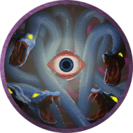
I don't think I recognize the picture though, so minus marks and also the links are not in proportion as compared to the image. The last one is running out..........
2 // 10
I don't know how to put this, er... I guess you could say the layout is organized, but the text isn't? Idk, kinda unpleasant to look at. Maybe if you added a background that defined the text locations or grid them? I really do not know, haha.
Very nice with the colours and image use. The links look splendid. A higher quality image would look slightly better, but other than that, looks fantastic! 8/10
Love the black bar under the white image. Adds a bit of contrast, and the banner is also quite neat. I seem to be on a bit on a minimal rush lately. 8/10
I mean, it's really plain I guess. I'm gonna give it a neutral 5 // 10, just because your avatar makes clear the reference (eeexcept for anyone who doesn't watch Doctor Who... (or is on tumblr I guess... (or the internet... (or british))))