Main block
CSS
border-left: solid;
border-bottom: 5px solid;
border-color:#(insert hex code);
border-radius:0px 0px 25% 25% ;
background: URL(url for bg image);
cursor: url(
https://66.media.tumblr.com/tumblr_m2wjmlkTow1qfamg6.gif), auto;
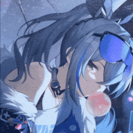
Avatar container
CSS
border-radius: 50%;
border: #(insert hex code) 5px solid;
Your name
CSS
text-transform: uppercase;
background-image: url(insert image or gif url here);
-webkit-text-fill-color: transparent;
-webkit-background-clip: text;
font-family: 'Press start 2p';
font-style: bold;
font-size: 25px;#
Statistics
CSS
border-radius: 25px;
border-left: 5px solid #(insert hex code);
border-right: 5px solid #(insert hex code);background: #fff;
padding: 10px;
-webkit-box-shadow: 15px 5px 19px -7px rgba(224,217,224,1);
-moz-box-shadow: 15px 5px 19px -7px rgba(224,217,224,1);
box-shadow: 15px 5px 19px -7px rgba(224,217,224,1);
color: #(insert hex code);
font-family: 'Play';
font-size: 10px;
Mini Biography
CSS
border-radius: 25px;
border-left: 5px solid #(insert hex code);
border-right: 5px solid #(insert hex code);
background: #fff;
padding: 10px;
-webkit-box-shadow: 15px 5px 19px -7px rgba(224,217,224,1);
-moz-box-shadow: 15px 5px 19px -7px rgba(224,217,224,1);
box-shadow: 15px 5px 19px -7px rgba(224,217,224,1);
COLOR: #(insert hex code);
font-family: 'Play';
font-size: 10px;


![[PokeCommunity.com] Post Flair Showoff! (has flair templates too!)](https://i.ibb.co/1T0XmDg/queenie-flair-2.png "[PokeCommunity.com] Post Flair Showoff! (has flair templates too!)")